

West Psychological Services
brand refresh
West Psychological Services is a team of forensic and clinical psychologists. Their old branding was dated and looked like everyone else's in the field: careful, clinical, a bit beige.
The brief was clear: bold, fun, and less health and corporate. Still credible in a clinical setting, and not forgettable.
There was one practical problem. "West Psychological Services" is a lot of name for a logo, so I gave them a monogram: a W that stands on its own and works as an icon, an avatar and a stamp. The full name sits beside it when there's room. Lilac, emerald and lime against deep teal and warm cream keep it bright but grounded, with Poppins for a friendly but sturdy voice. A set of sliders maps where the brand sits between formal and casual, cold and warm, serious and playful. It's a quick reference for anyone using it.
I was brought in as a freelancer by the designer building their website, so the logo and the site could be developed side by side.
I designed the brand. The team made it their own. The Instagram below isn't my work, but it's full of ADHD explainers, psychologist humour and a cat called Ziggy, all in the same voice and palette.
Skills
Turning a client brief into a creative brief
Logo and monogram design
Branding system: logo, colour, type and tone-of-voice scale
Pitching to a client and managing feedback
Client
West Psychological Services
WPS brand refresh


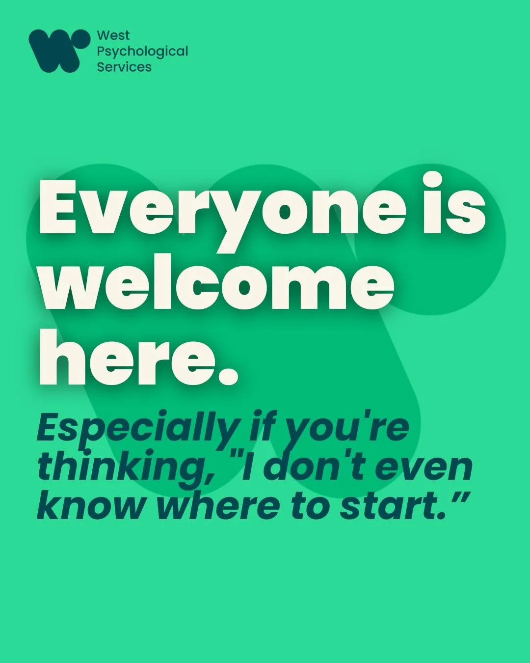
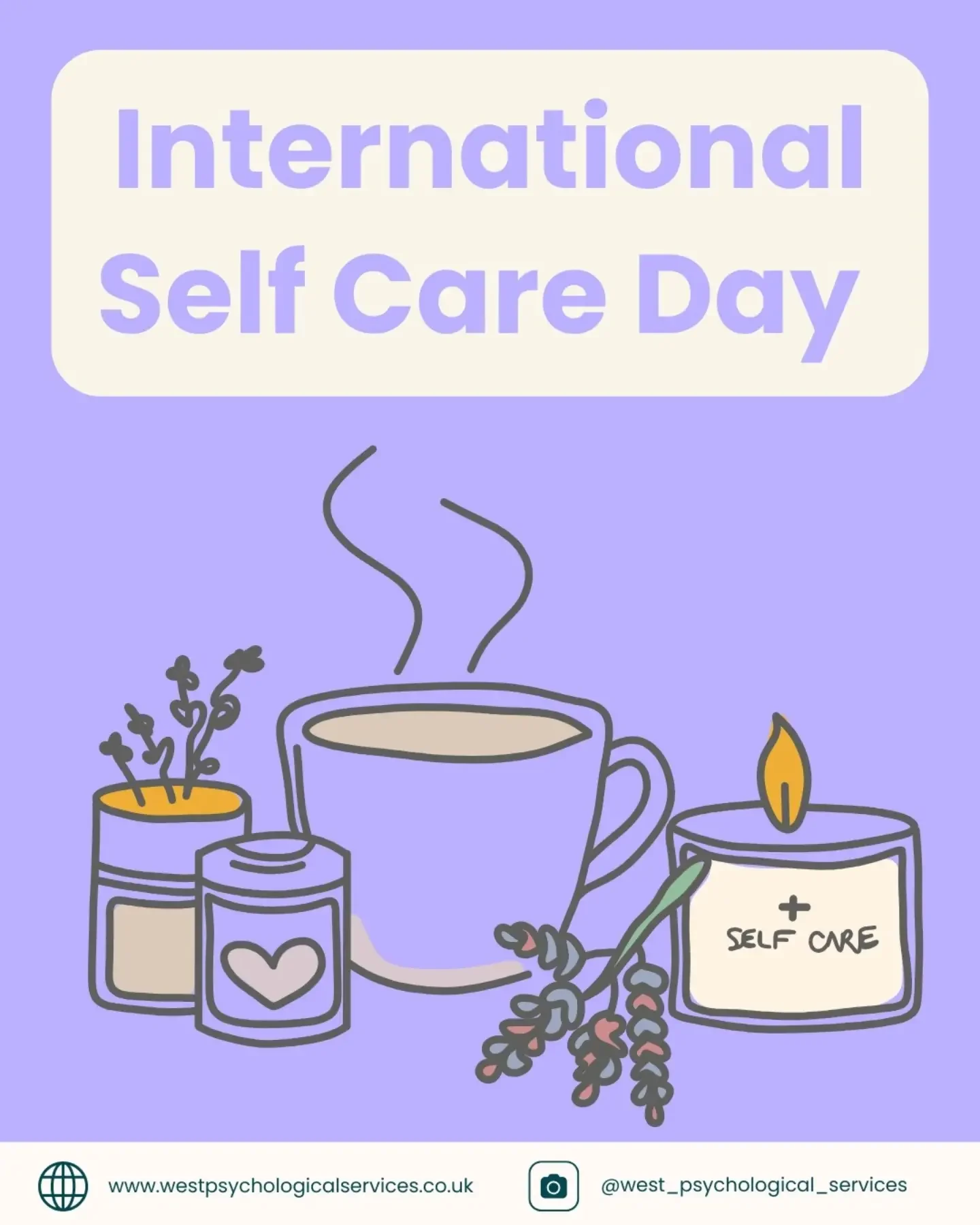
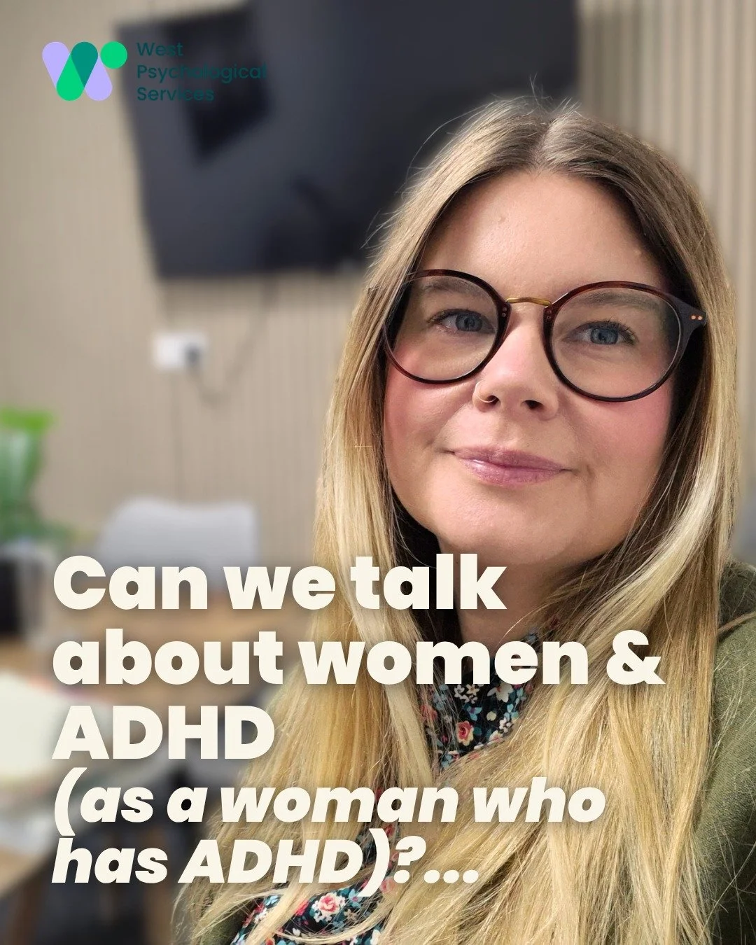
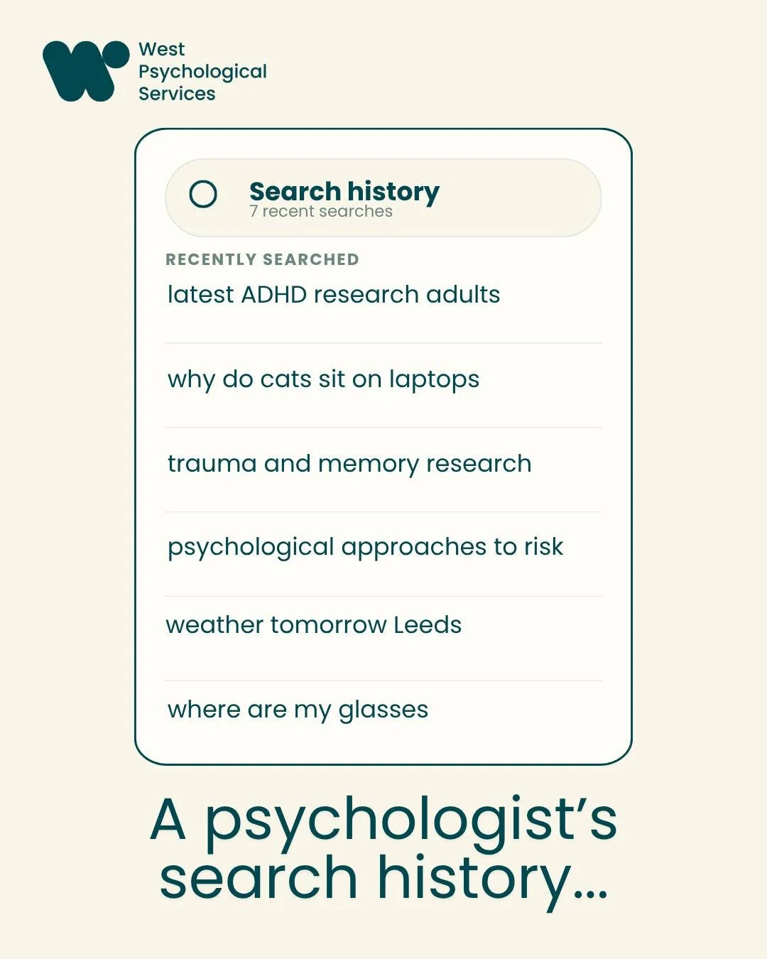
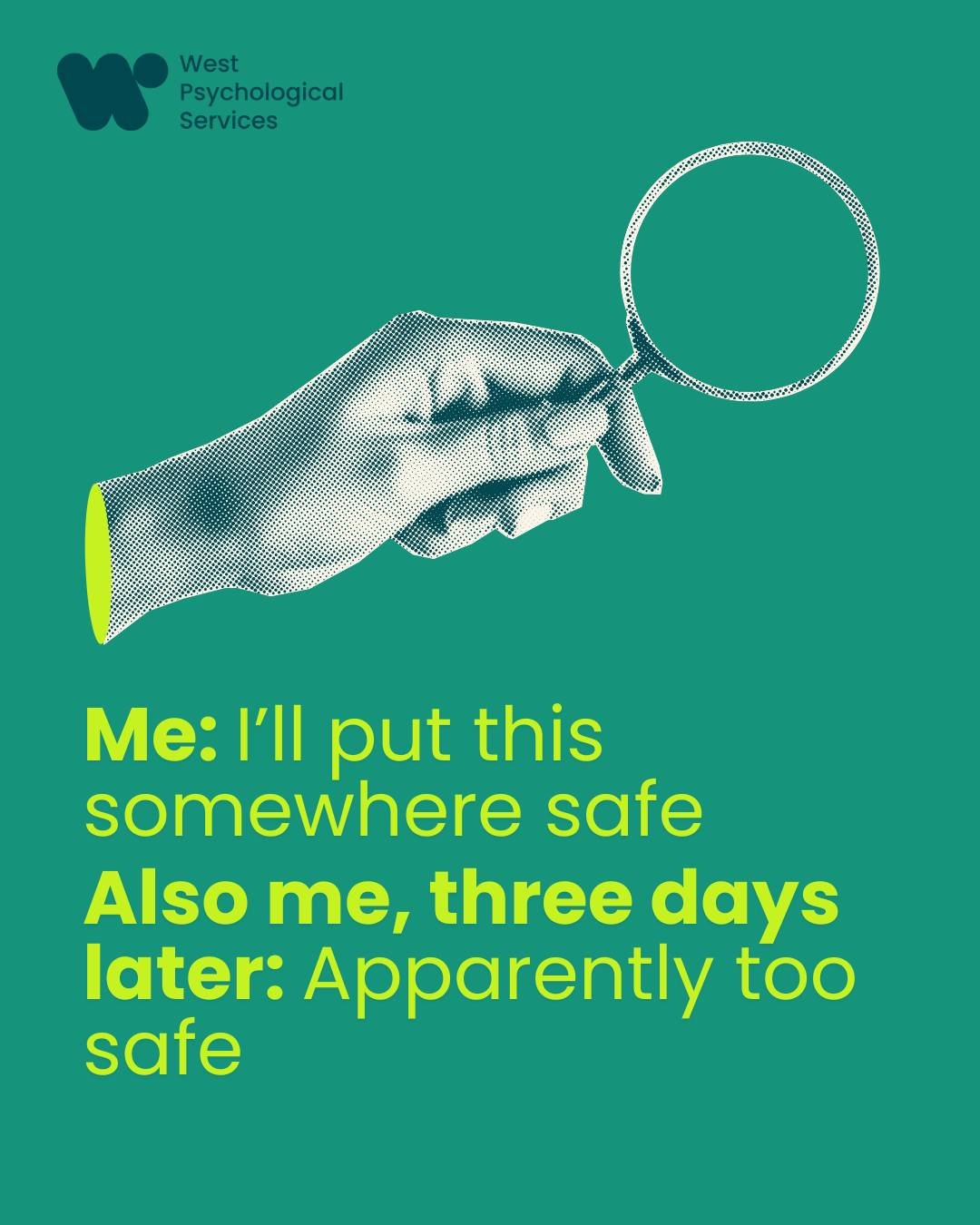

How they used the branding on Instagram
