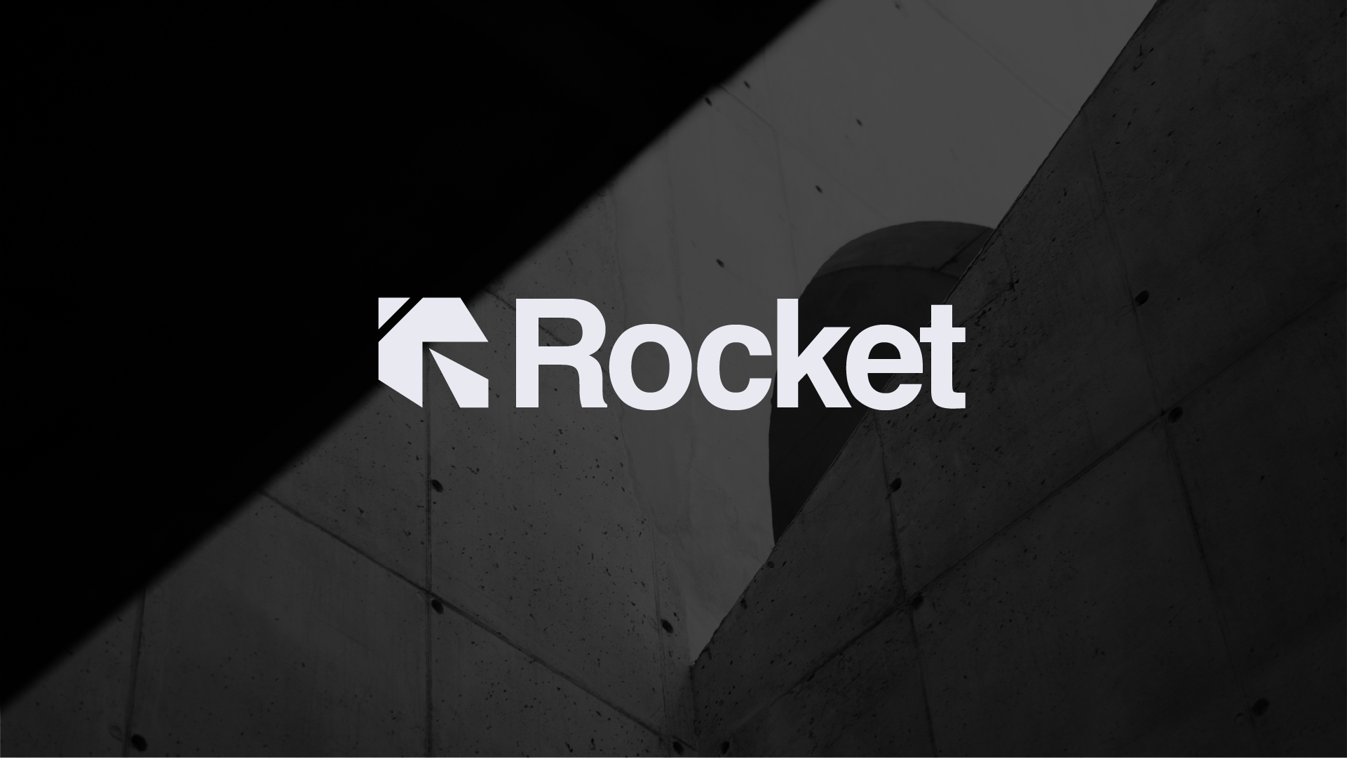
Rocket’s new visual identity
Rocket is an HR startup that helps companies talk to their own people. The CEO loved brutalist architecture and minimal design, and he had one rule: no obvious, cliché rocket. It also had to be professional and a little playful, which is a tricky balance for a company called Rocket.
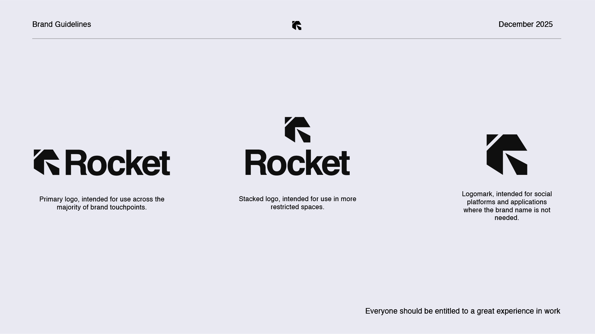
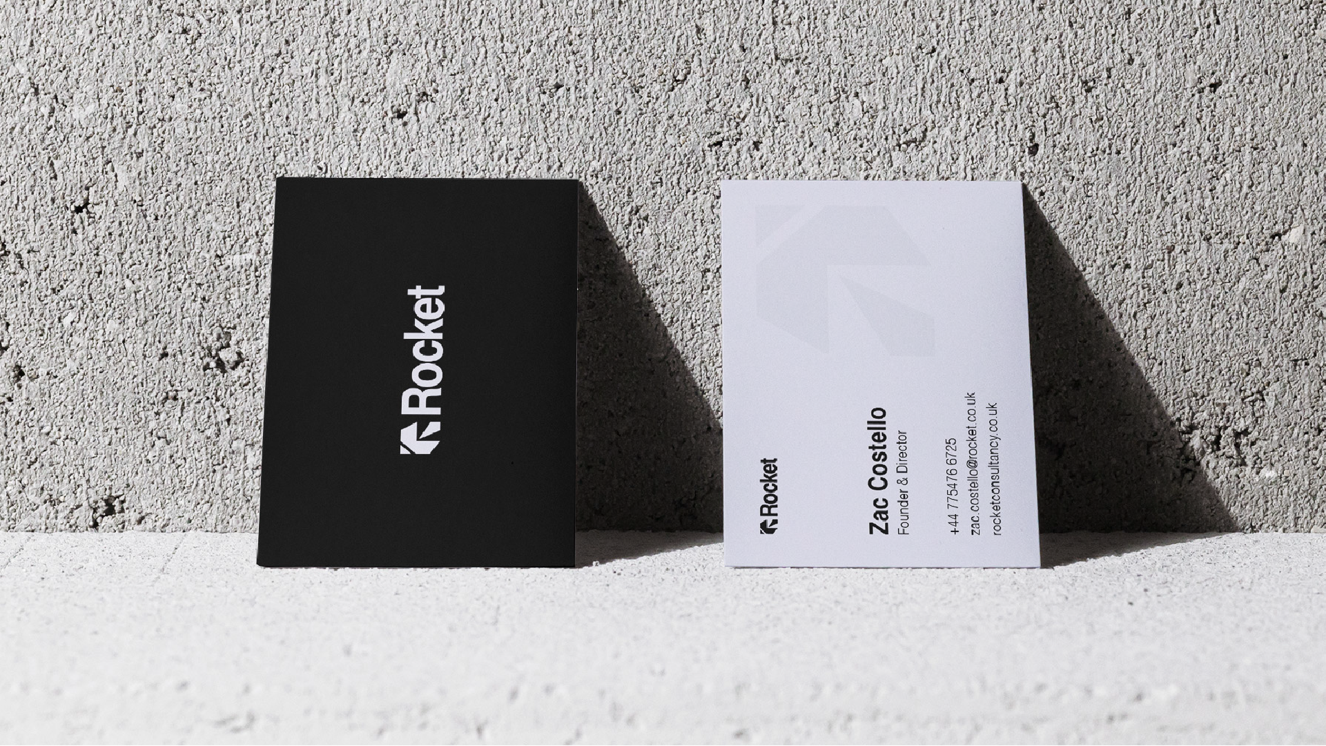
So I hid it in the R. The top-left corner is the tip of the rocket. The middle is the wings. The right leg is the flame. It's simple, heavy geometry, like concrete, and you only see the rocket once someone points it out.
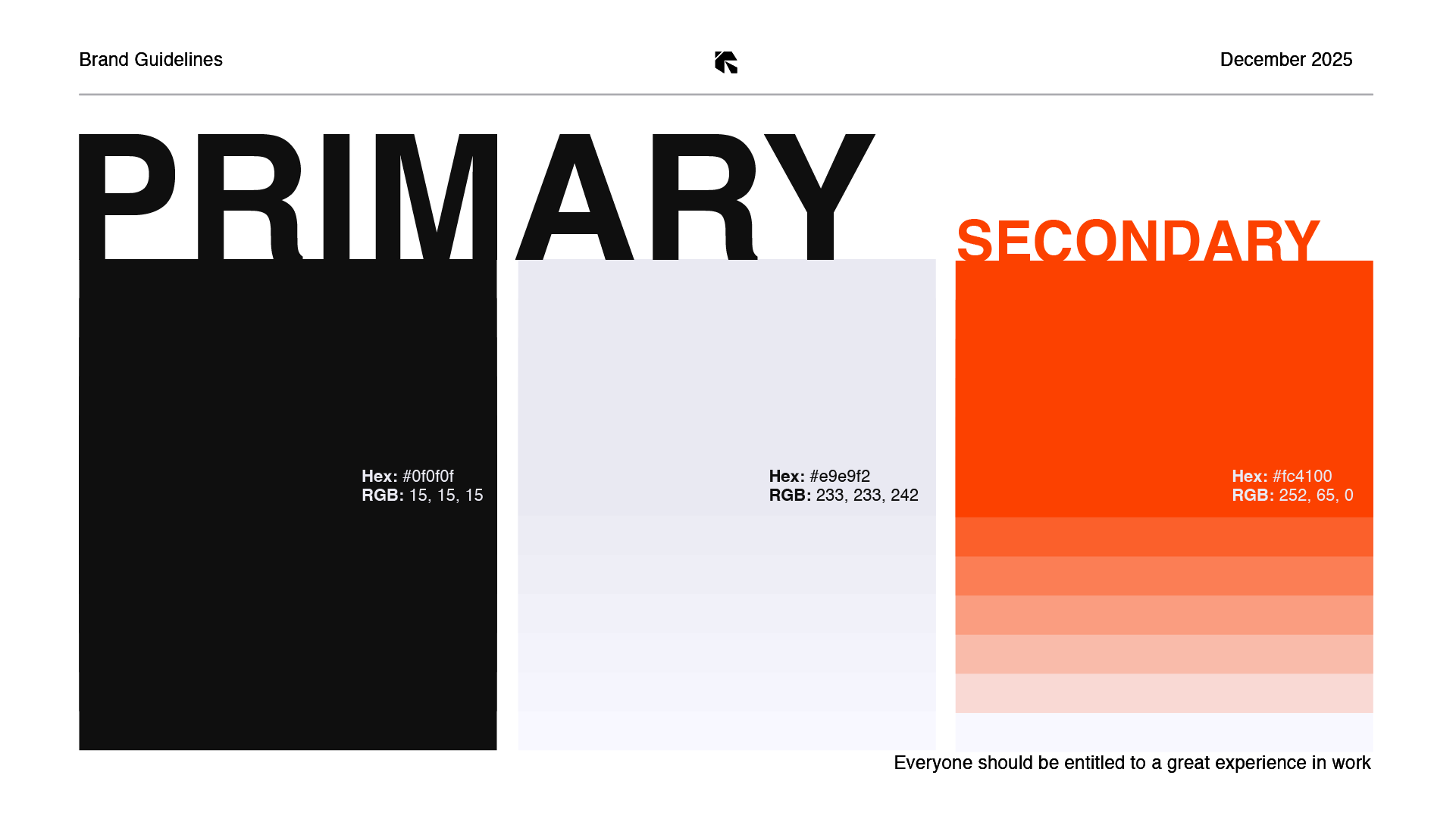
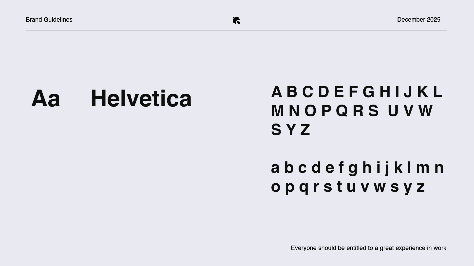
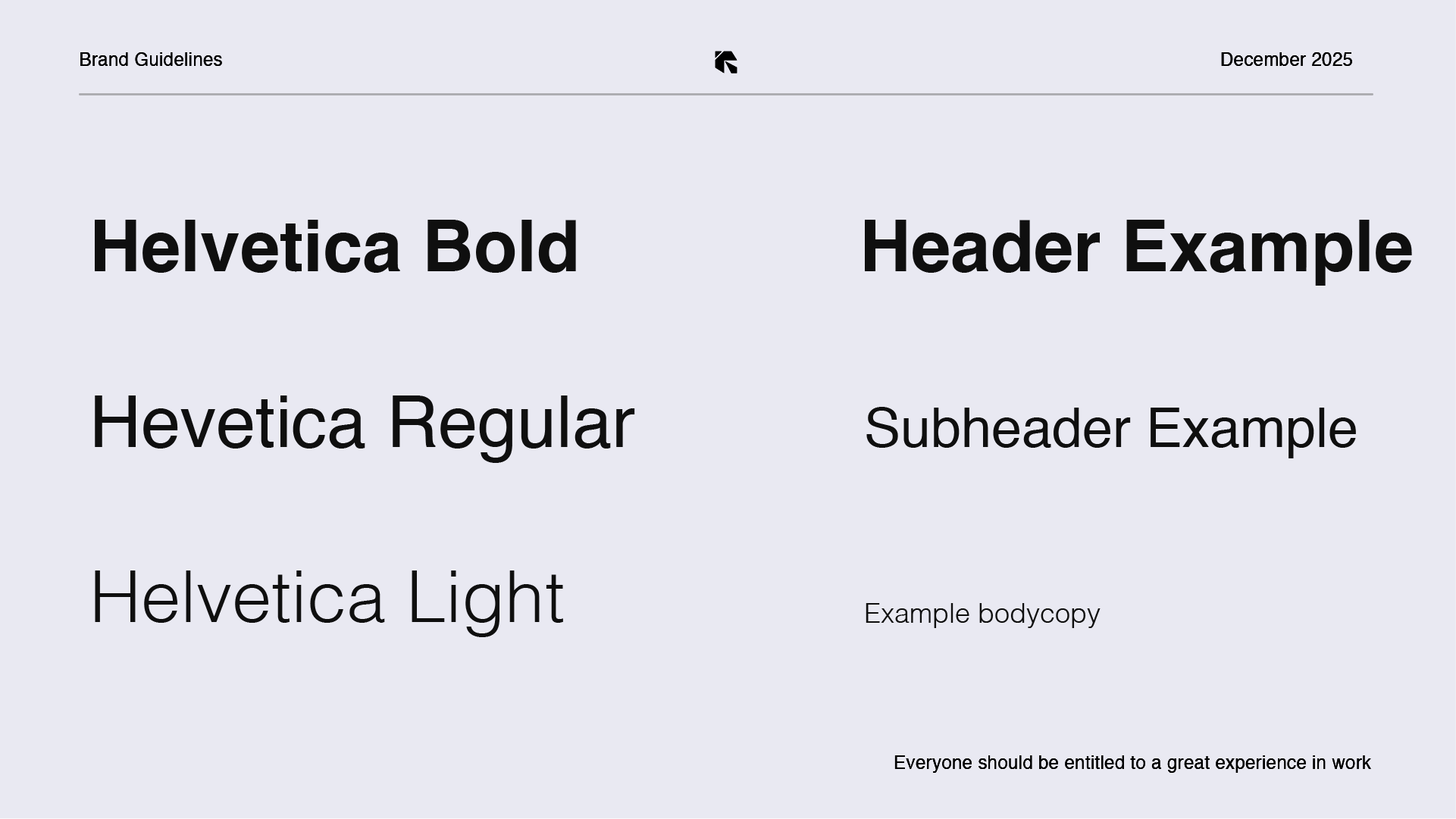
Black and off-white do the structural work, with a sharp orange-red as the accent, in the guidelines and on the website. Helvetica throughout, blunt and clear, because a brand about communication shouldn't be fussy.
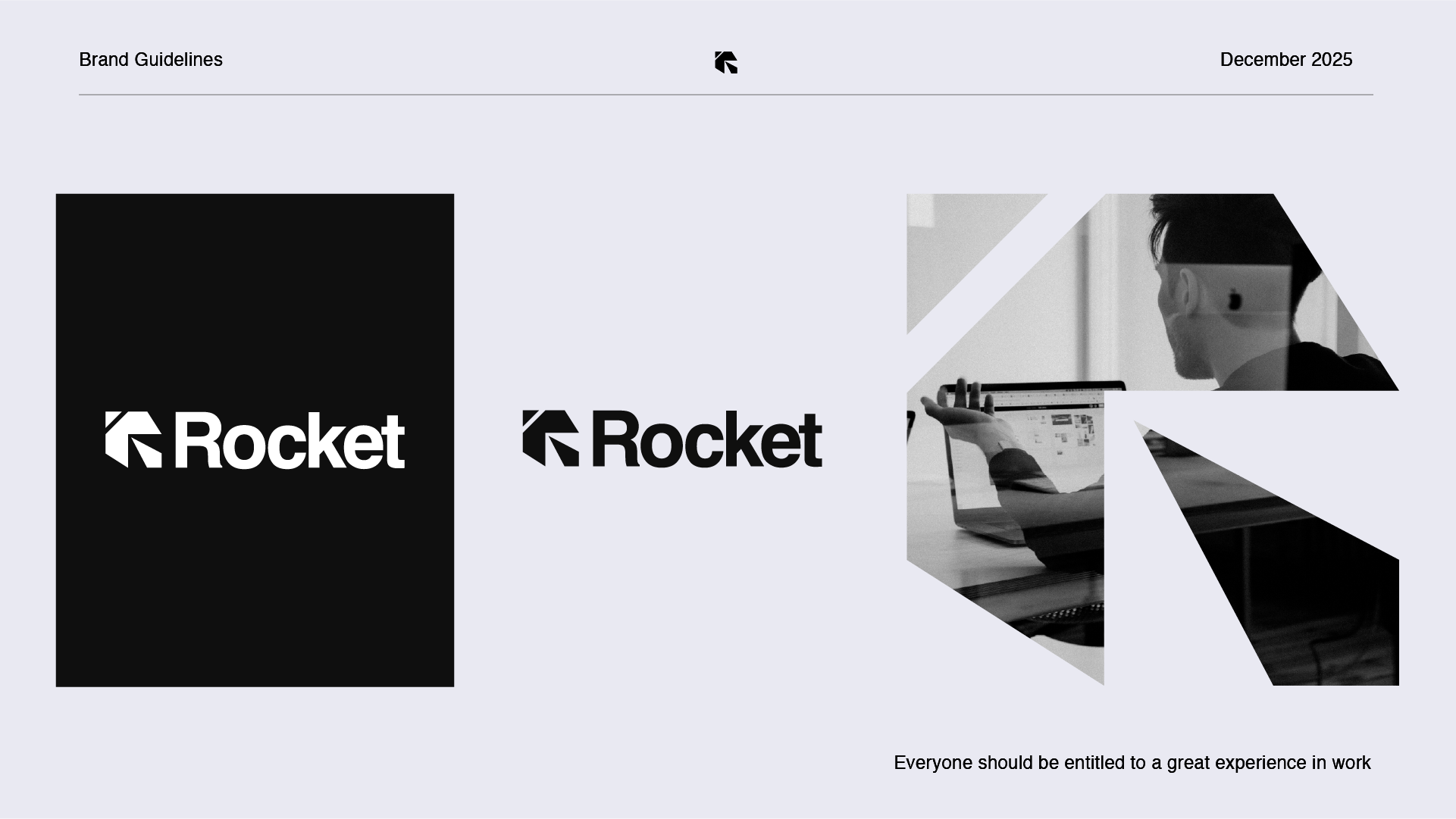
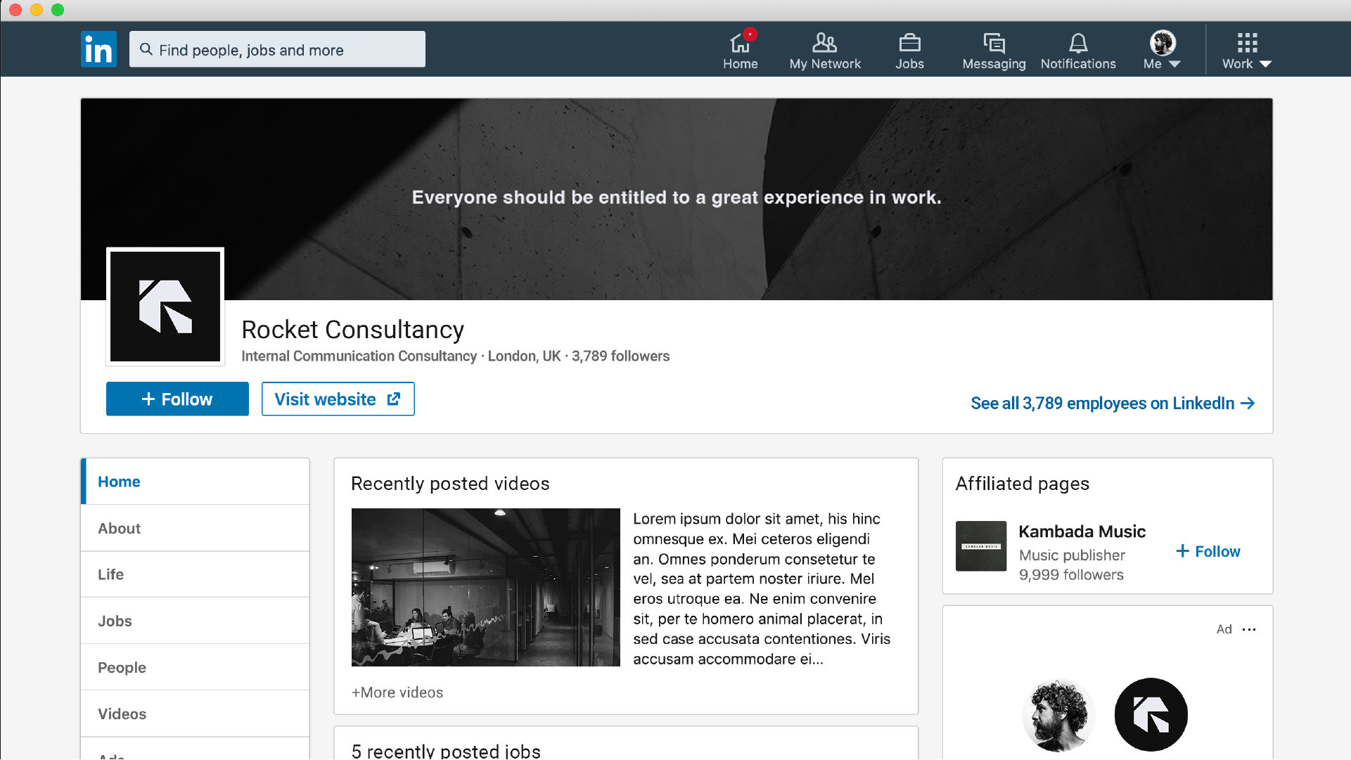
I built it out as full brand guidelines: a primary logo, a stacked version and a standalone mark for tight spaces, plus colour, typography and usage rules. It took one route and a few tiny tweaks, and the client loved it. It's live today.
Skills
Turning a client brief into a creative brief
Logo concept and design
Brand guidelines: logo system, colour, typography, usage
Pitching to a client and managing feedback
Client
Rocket Consultancy
Rocket Branding Guidelines