Farm Watch logo design
"Neighbourhood Watch meets Facebook, but for farmers."
That was the brief from Solster Limited, a software engineering company building for the farming industry. Farm Watch was a new community and safety app for people who work a long way from their nearest neighbour. They needed a brand for their investor pitch, so it had to look trustworthy and credible without being overworked.
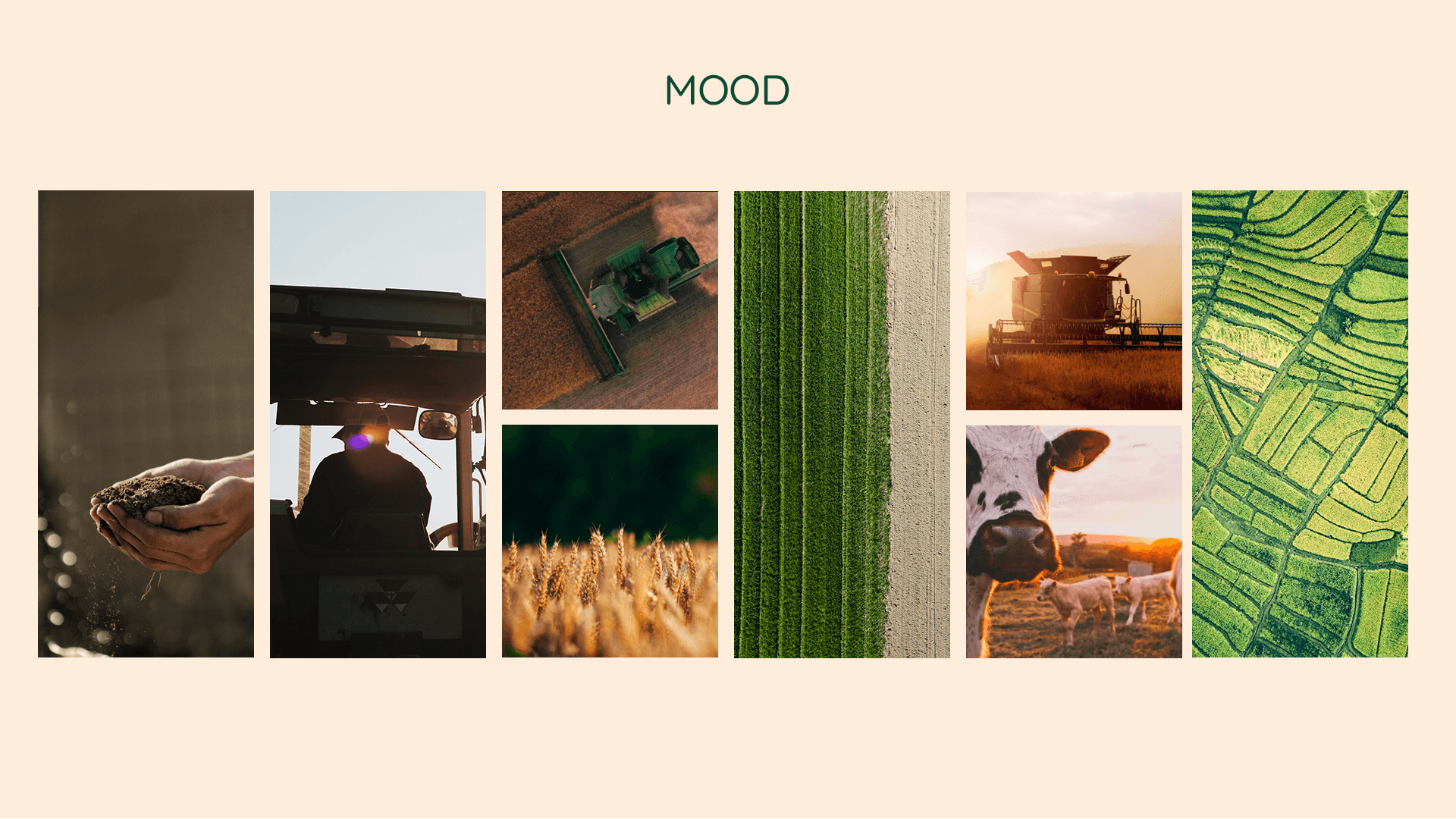
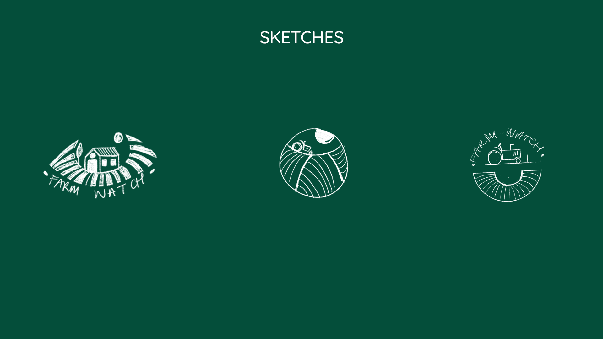
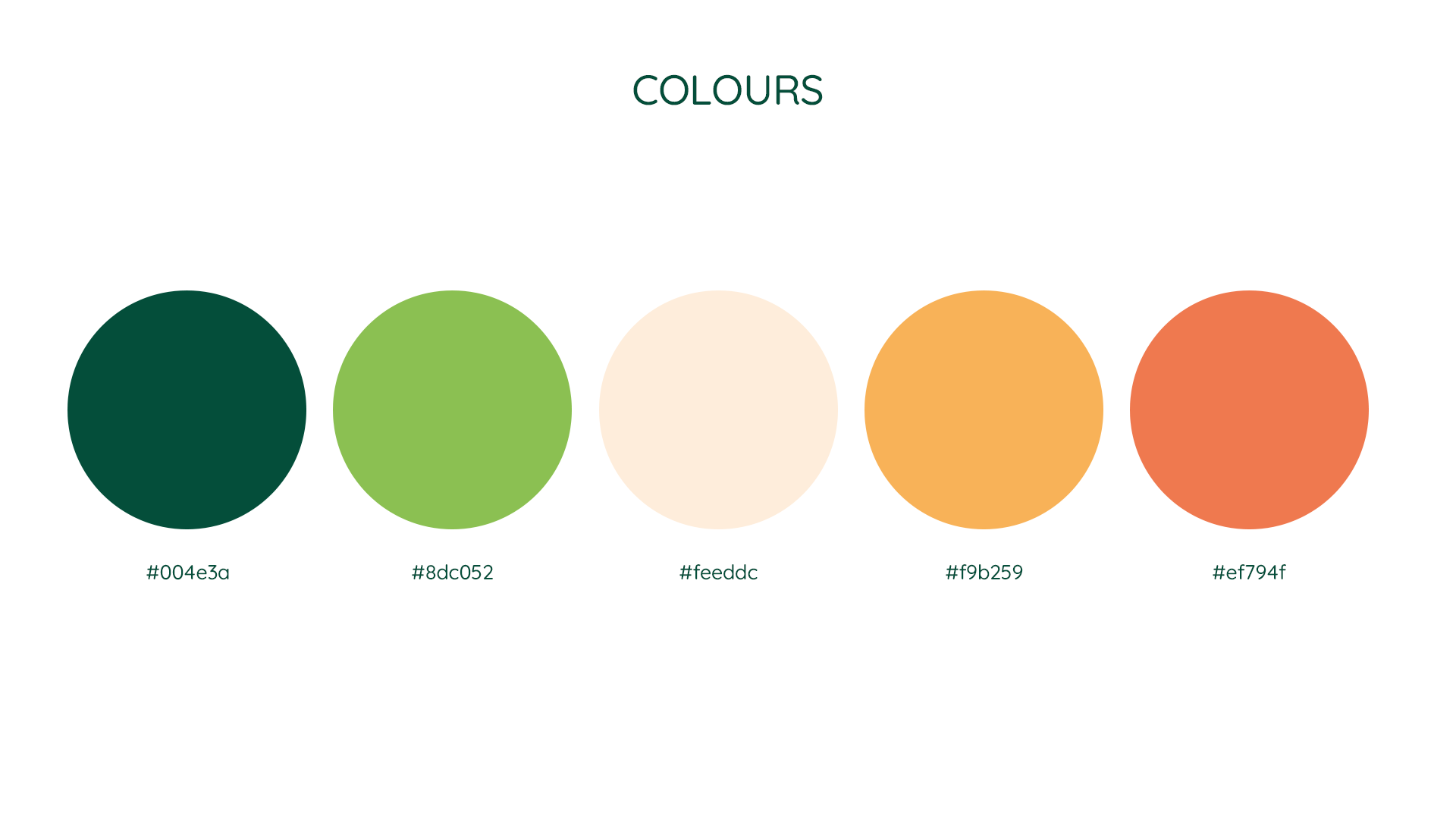
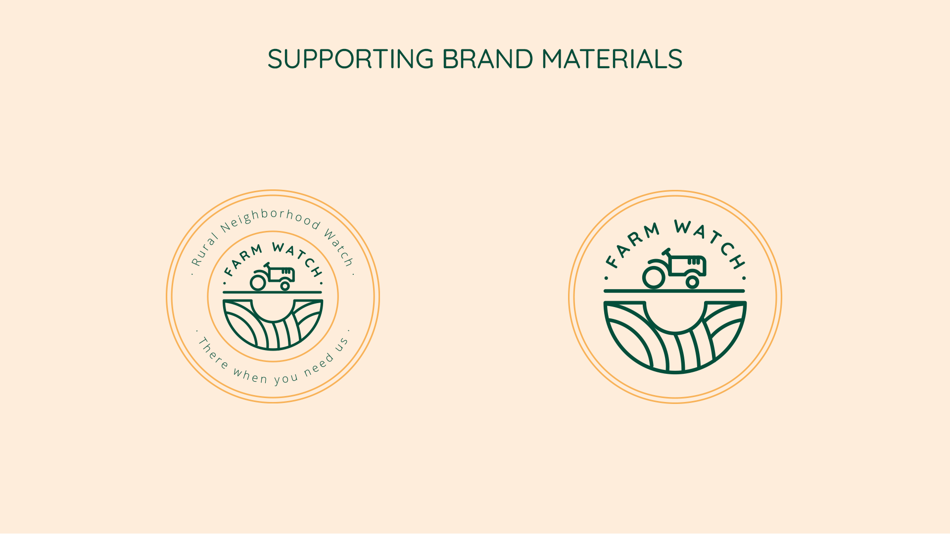
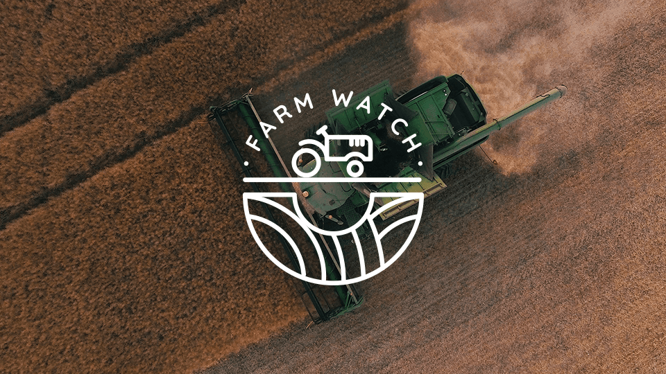
I started with a mood board of real fields, machinery and soil, then sketched three routes. The one I took forward was the tractor over a field seen from above, because the curve of the field reads as an eye. That's the "watch": someone looking out for you, tucked into the shape. It sits in a round badge, like a community patch, in deep green for the land with amber and orange for warmth.
I showed the work at every stage, so by the time it went to the client it needed just one round. I also made a supporting badge, "Rural Neighbourhood Watch. There when you need us.", so the brand worked as a community mark and not only as an app icon.
Client
Solster Limited
Skills
Turning a client brief into a creative brief
Logo concept and design
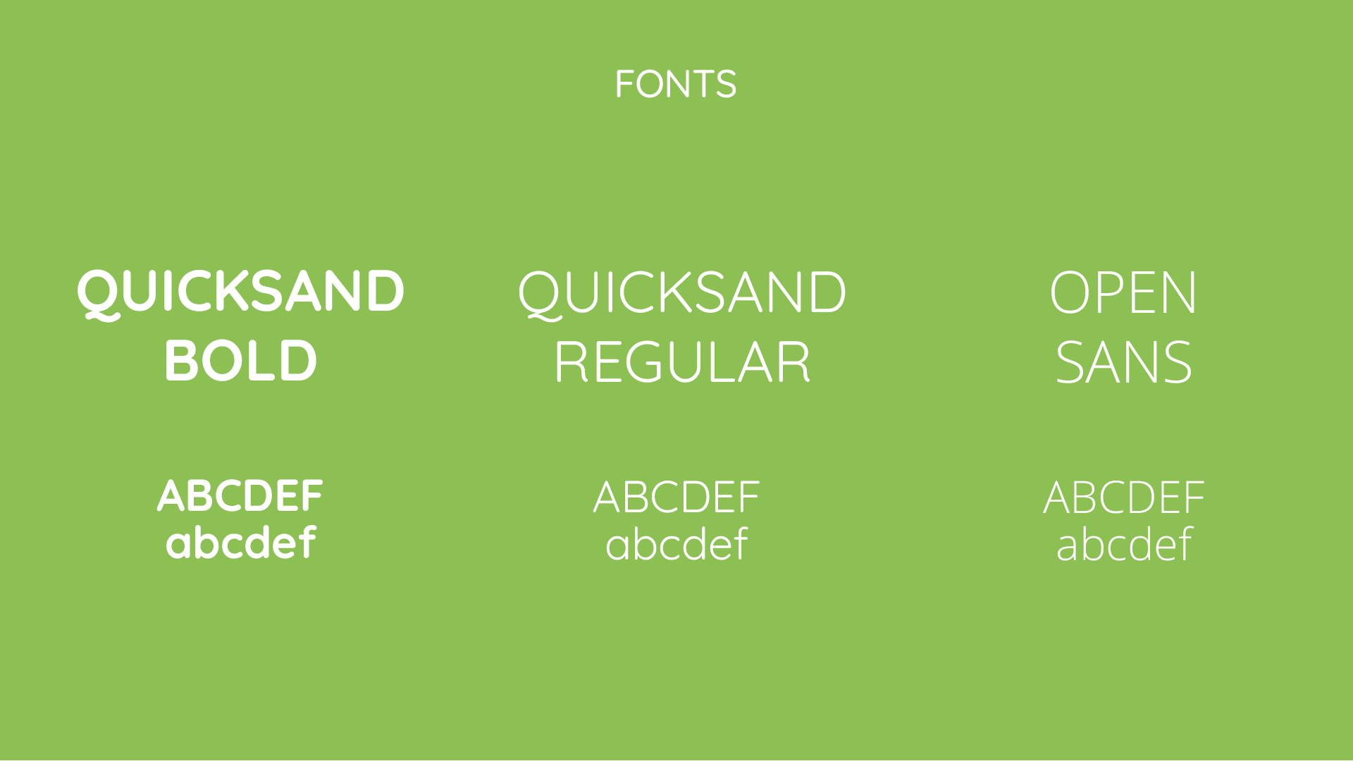
Branding system: logo, badge, colour and type
Pitching to a client and managing feedback
Farm Watch logo design