Digital Rebel logo design
Digital Rebels is a software company that mostly builds for law enforcement. It's serious work, and they wanted a brand that didn't look like it. They had a point of view: digital services should solve real problems for people, and be a little less corporate about it.
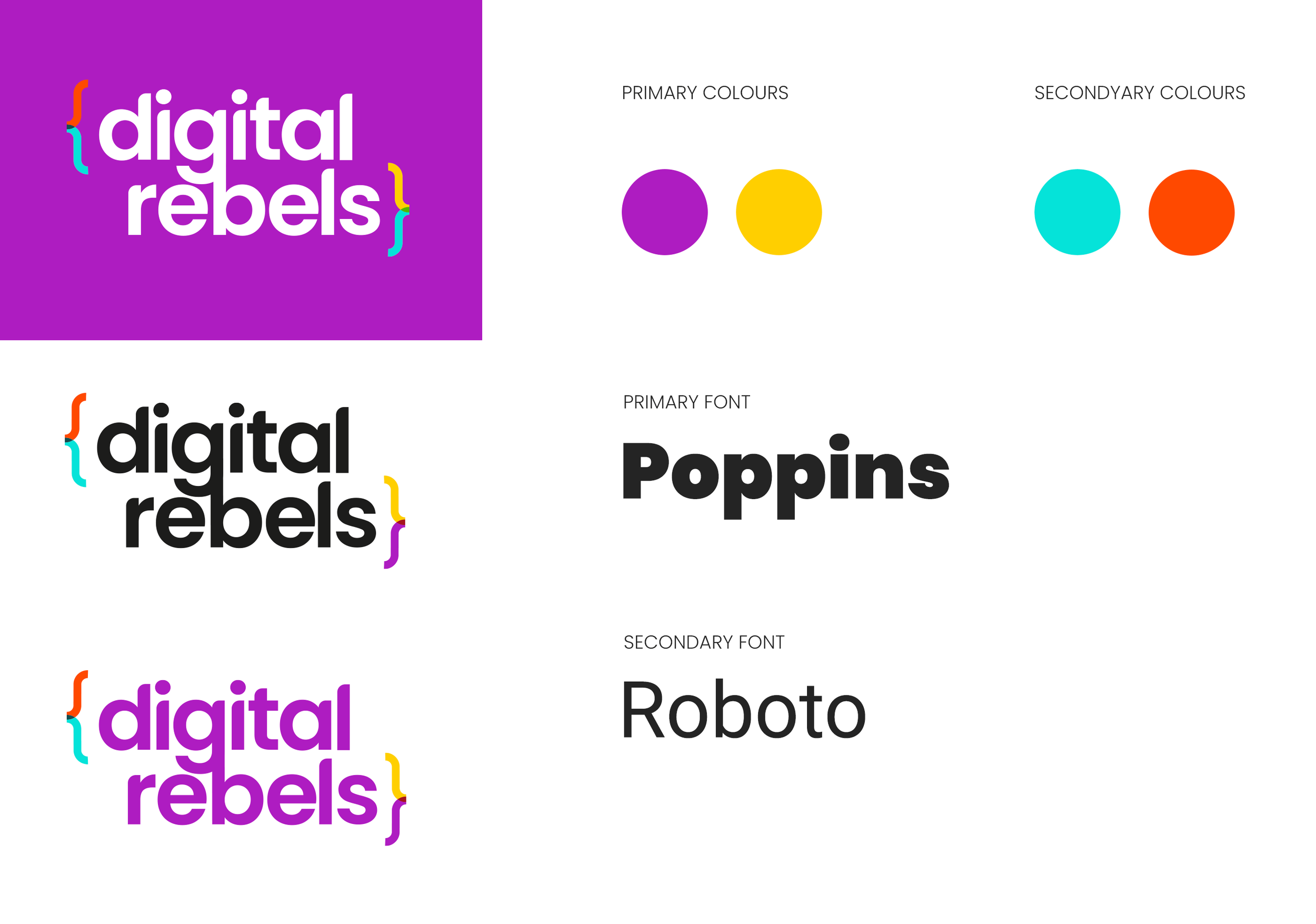
The bracket idea was mine. Curly brackets are the punctuation of code, so they say "software" before you've read a word. I pulled them apart into different colours, so the tech comes with some attitude. Bold purple, with yellow, cyan and orange breaking it up. A heavy, friendly Poppins. And "making humans awesome" underneath, because the people are the point.
First round, first route, and it was the one. The brand is live and in use today, with a website of its own.
Skills
Turning a client brief into a creative brief
Logo concept and design
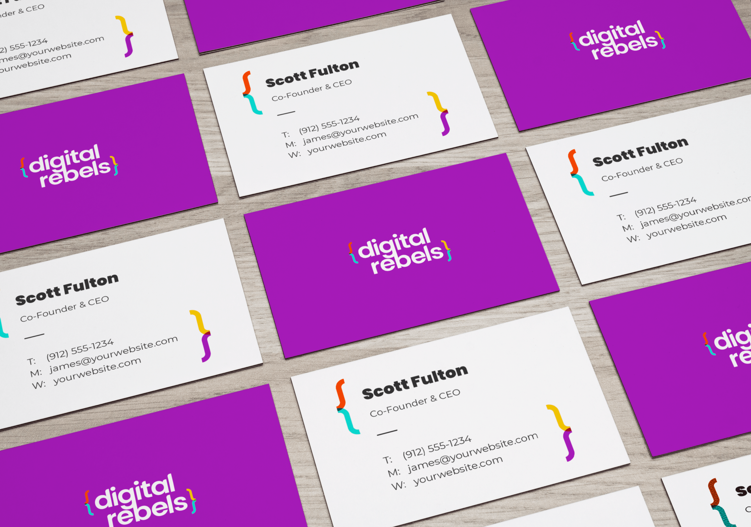
Branding system: logo, colour, type, business cards
Pitching to a client and managing feedback
Client
Digital Rebels
Digital Rebels logo design